

You’re Probably Reading this Because Someone Asked You to Run One
Let’s be honest…if you’re doing your first cohort analysis, it’s probably because a VC or marketing manager asked you to run one. And you just want to figure out the quickest way to pump one out so that you can get back to important things like working on your startup.
In reality, if cohort analyses are relevant to you (i.e. you care about retention), then they might be the best indicator of health for your startup.
It’s worth doing it right the first time because:
- They provide a truly objective health metric for the growth of your app or platform.
- It’s something that any potential investor will request if they’re worth their salt. It’s easy for anyone to scour for a vanity metric like “1m widgets looked at!” (protip: always round up widgets to the nearest 1m). It’s much harder to lie about a solid 30-day retention.
Here, we’ll go over the pros and cons behind different types of analyses, how to create them down to the bare SQL, and how to monitor and analyze them.
WTF Is a Cohort Analysis
Broadly, a cohort analysis is any analysis performed on a group of people that share a similar characteristic. When people talk about them in startups, however, it refers to an analysis of user retention, where users are grouped by a date interval. (Usually monthly) That is, how many of your registered users are still available on Day 0? Day 7? Day 30?
A cohort analysis can come in graph or table form, as both have their use, which we’ll discuss later.
Don’t Use An Out-Of-The-Box Solution
There are a few out-of-the-box options that you can use, such as RJ Metrics, Mixpanel, and KISSMetrics. From my own experience, these have all sucked. While it’s easy to insert a snippet of code and generate a cohort analysis from them, here’s why you should perform a cohort analysis without them:
- It’s easy enough if you know SQL. If you don’t, learn it. No growth hacker is worth their salt without it. With knowledge of SQL, you can easily create visuals using Excel or Periscope. In fact, if you want to reach any sort of intermediate growth hacker level, I highly recommend that everyone get Periscope. No, I’m not a paid advertiser (although like any good marketer, I will be flirting shamelessly with them on Twitter to get this shared), but Periscope is the most powerful platform for any growth hacker.

- You never know what ad hoc cohort analyses you’ll need to run. At Fling, we learned that users who followed more than 10 people in the first 24 hours were more sticky than your average Snapchat user. It would take ages to do this with out-of-the-box solutions.
- It’s important to define what goes on under the hood. At Fling and other startups, I’ve made it a point to define “retention” as any user who does a meaningful activity (sending a fling, reaction, chatting back to someone, etc). Cookie-cutter solutions will make it difficult to either define retention or the cohort itself.
Your First Cohort Analysis: A User’s First Week Experience
All righty, let’s create our first cohort analysis using SQL and Periscope. Microsoft Excel works also. I’m not a fan of most Microsoft products, but unfortunately their PivotTable is one of the most powerful tools for analysis. (Someone create a startup to fix this please.)
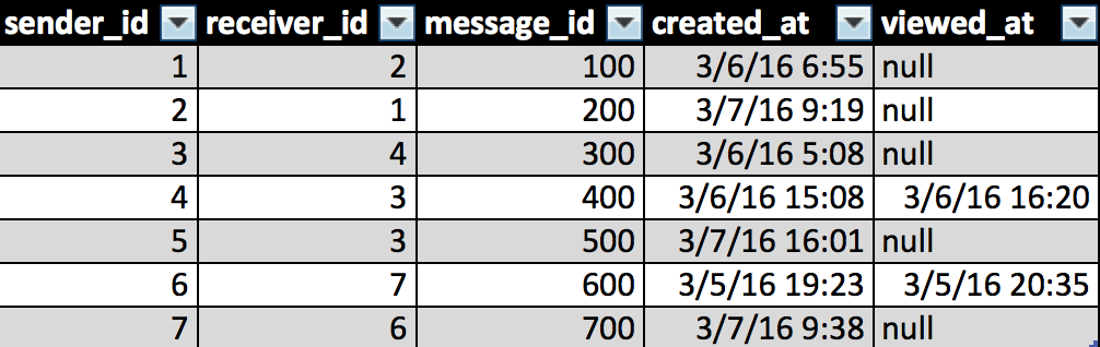
For any cohort analysis, you’ll need to create a table or view of users and their activity times. The simplest thing to do is create a distinct queryset of user id and the date which they were active. Let’s pretend you have a messaging platform. For simplicity’s sake, let’s pretend that users can only send, receive, and view messages. Here’s the schema:
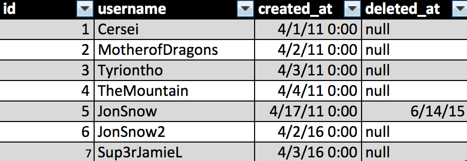
There is also a table which records user signup information. Let’s keep it simple and say that the columns are simply: a distinct ID, a username, the date in which the user was created, and an optional column in case the user is deleted.
In the example above, users are active on a given day if they send or view a message. In all likelihood, you’ll have multiple tables that you’ll need to combine in order to describe a user’s activity, and you should give the definition of “active” some thought. For example, it’s worth pointing out that simply receiving a message doesn’t make a user active.
Now, we’ll want to create a resultant table that describes a list of users on days that they are active. In the example above, here is the code we would use:
The resultant table is a list of active users on certain days:  The result table is super duper important. Like really important. It will be what your cohort analysis is based on. Now, we have everything that we need for this analysis: our users table and the resultant table. Let’s create a cohort analysis for the user’s first week. This is an extremely important analysis, because the experience of a user’s first week dictates whether they become a loyal user that frequently returns to your app or simply toss your app to the side. I’ll talk a bit more about this later, but Andrew Chen has a really good writeup on user churn over here. For now, I’ll show you how to create this analysis without Periscope, but future examples will all rely on Periscope for brevity’s sake.
Notice that the first snippet of code is being described as a temporary table called “activeusers.” After describing your own activeusers table, you can pretty much copypasta the rest of the code above and create your own first week cohort analysis.
(Note: The data below is completely made up using the trusty ol’ random() function and combining a few sources. Much harder than it seems, but it’s important for me to blind user data any time there is a blog post like this.)
The resultant table should look like this:
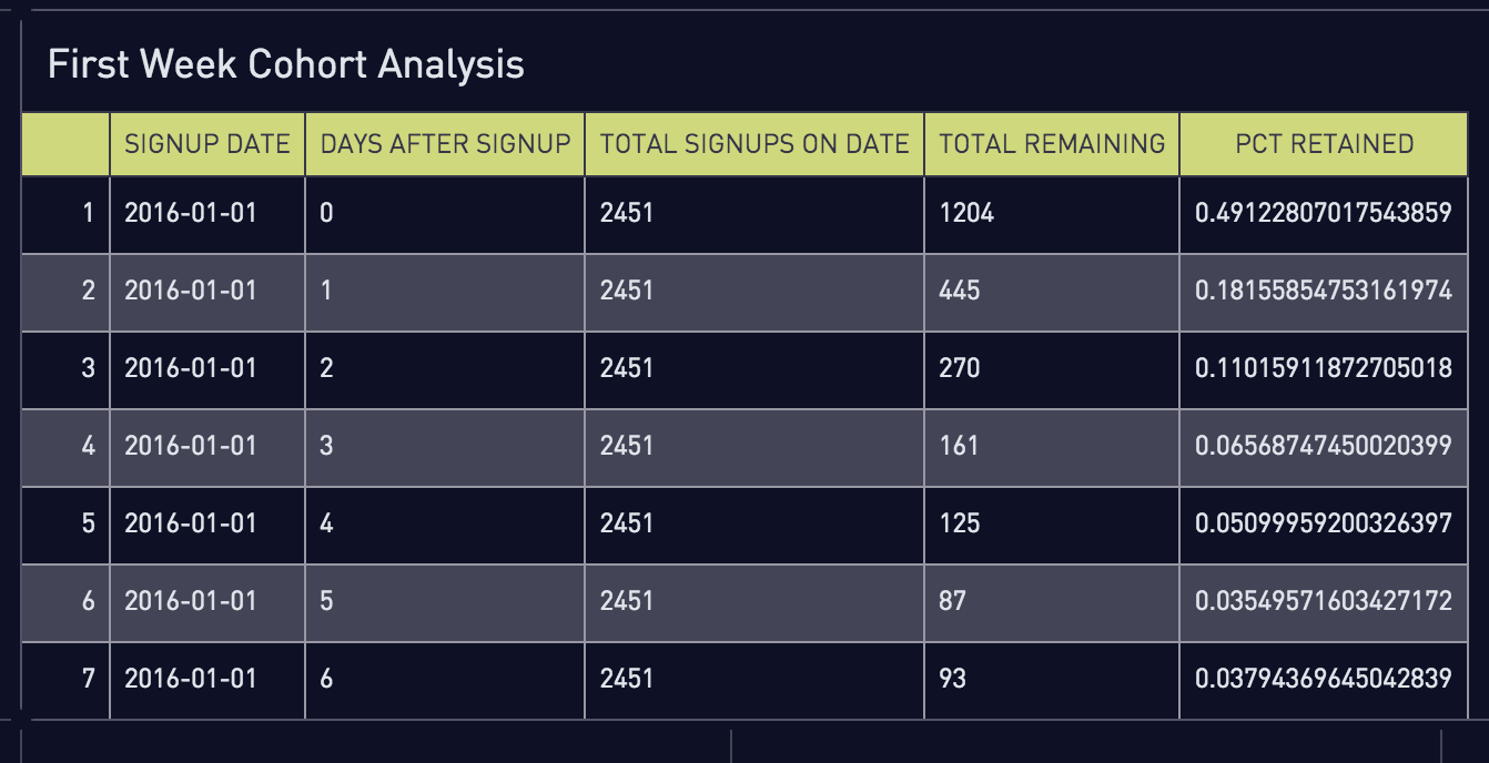
Not very easy to read, right? At this point, you’ll want to go into trusty old Excel and use the only function worth its salt–the PivotTable. Create a PivotTable with the selected data, using signup_dates as the rows, days_after_signup as the columns, and pct_retained as the value. Suddenly, it becomes much more readable and analyzable.
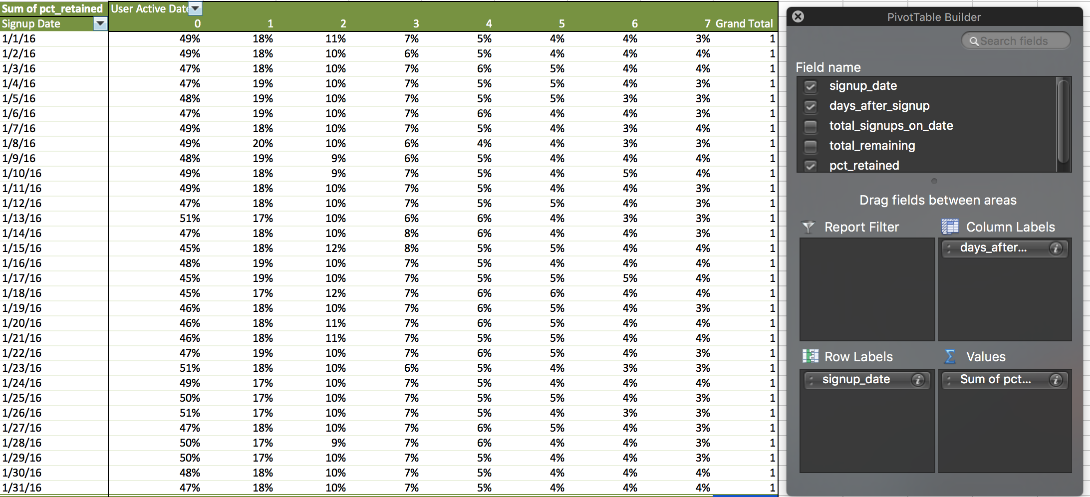
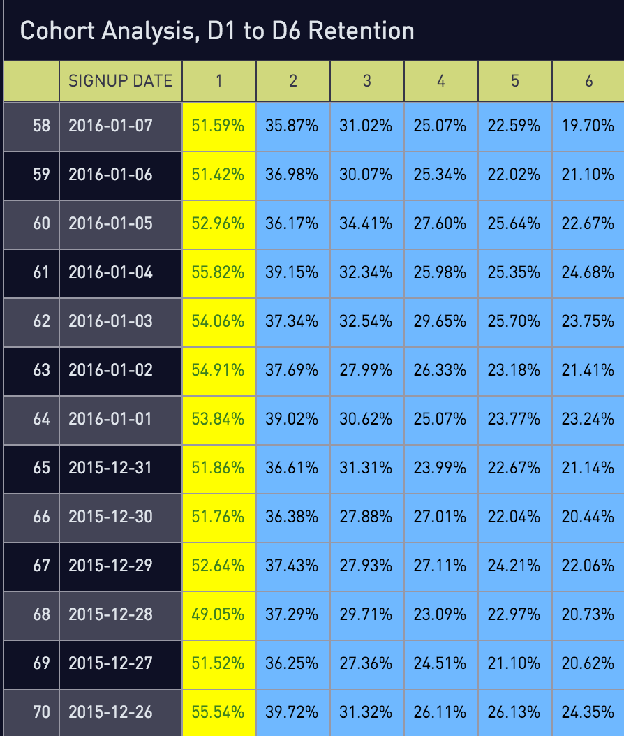
What Does The Data Say Tho
The first thing to note is that by day 7, retention is a mere 3-4%. Now, that’s not necessarily a bad thing depending on your app; perhaps users only come back 2-3 times per week and it would be better to capture retention in intervals (e.g. Week 1, Week 2, Week 3). One of the weaknesses of this type of analysis is that it’s not very accurate when answering the question of “how many users are left?”
This analysis does tell us a very important thing, however. Notice how Day 0 is consistently around 50%. That means half of your users aren’t taking any action when it comes to messaging–in other words they are not activating. The first order of business should be to prioritize activation.
Now, let’s look at this data a different way by changing absolute retention to day-over-day retention. In other words, only about 3% of all users are active on Day 7, but that number is 70% of the Day 6’s value. A look at day-over-day retention reveals the following data set:

It looks like retention stops dropping precipitously towards the end of a user’s first week. In fact, there are some days where more users return than they did on the previous day. Let’s take the averages across all values and graph them.
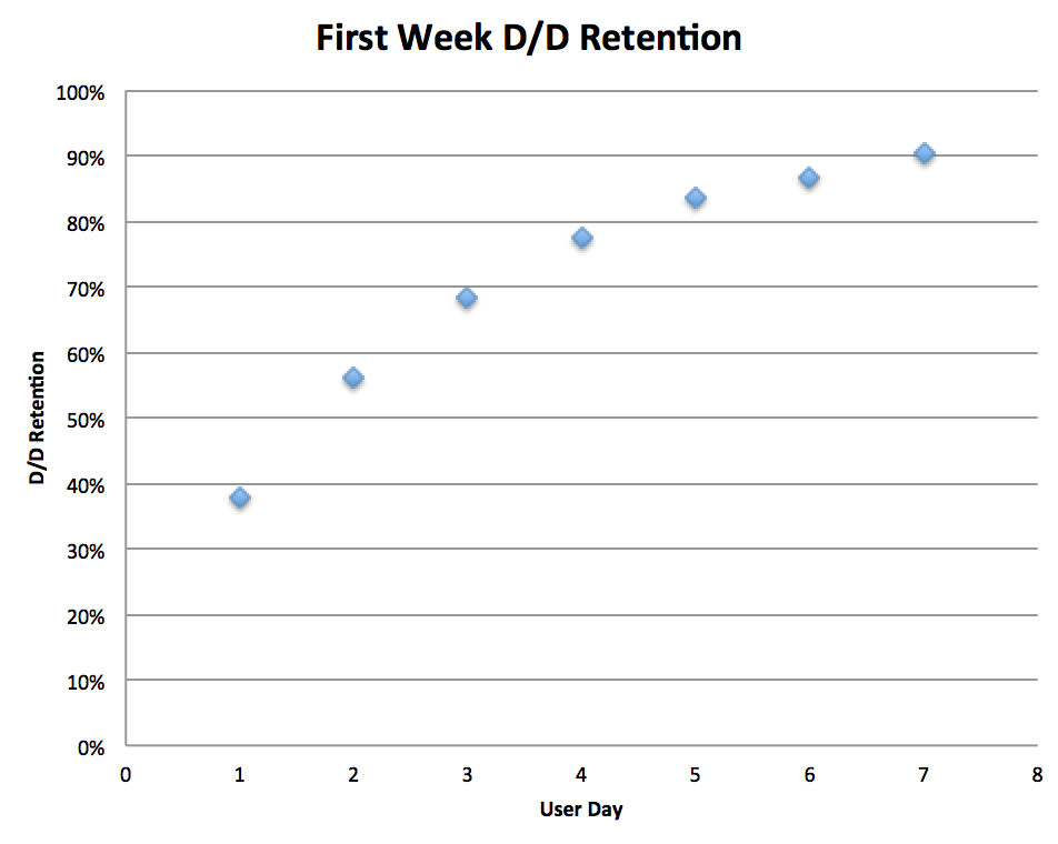
Notice that there’s a bit of an inflection point on the Day 4 mark? This means that if you focus on activating a user on day 0, and then retaining a user on days 1 to 3, there’s a high likelihood that you’ll reduce the leakiness in your first week’s retention bucket.
Part 2 will cover other types of cohort analyses, but in my experience, the first week analysis is the most important and most actionable to a growth hacker. At Fling, we were able to double week 1 and month 1 retention by simply focusing on the first few days on the platform. It all comes down to a user’s first experience. You might have the best restaurant in the world, but if you accidentally serve someone a shit meal on their first visit, they’re unlikely to return.
Stay tuned for Part 2 in which we’ll cover other types of analyses and their strengths and weaknesses of measuring your app’s stickiness.